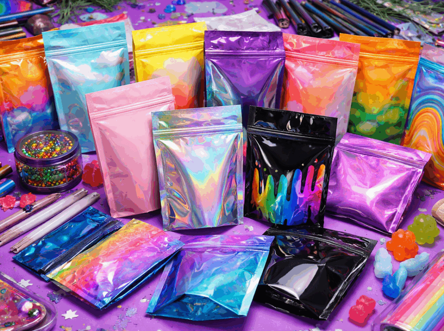
Those days of selling cannabis in plain baggies are over!
now the dispensary shelves are lined with slender jars and coloured pouches, and trendy tins. In a competitive market the packaging has become an unspoken sales person that can make or break a sale. It’s often the very first interaction a customer has with a product, determining how they perceive the quality, even their trust in the brand. In fact, it’s been shown through research that customers make an impression within seconds of looking at a package and as much as 90% of that impression is based on colour. Simply put, the way you box your product matters just as much as your product itself.
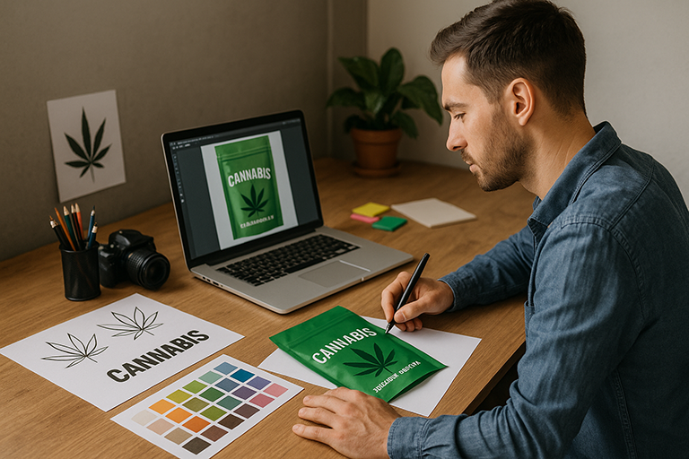
This article explores the psychology of packaging of cannabis and how design elements of colour, material, and finish can impact purchaser emotions and buying habits. From the colours which induce particular moods, through the materials which express high quality or environmental sensitivity, to the finishing touches which invite touch and contemplation and we’ll examine how well-crafted packaging can put your brand in a position of strength.
Colour Options Provoking Feelings and Indicating Strains
Colour is not only about appearance it’s a psychological tool that immediately conveys mood and meaning. In cannabis sales, colour options may convey emotional responses and even suggest the type of product or effect. Buyers frequently make an unconscious colour judgment about a product in a matter of seconds, and one study found that as many as 85% of consumers view colour as a key factor in their purchasing choice. Choosing the right palette for your packaging can literally influence whether a customer feels calm, excited, or confident about what you’re selling. Consider some common packaging, colour cues and the psychological impacts they have.
Green is practically synonymous with cannabis. It signifies nature, health, and sustainability qualities that many consumers accord to cannabis itself. An unaided green package can subconsciously signal customers, this product is natural and healthy, and that is why it is popularly known for medical or wellness-oriented products.
Black is Premium and Powerful, Sleek black packaging is now a shorthand for high-end status and power in the cannabis world. Black signals sophistication authority, and elitism. A matte black jar wrapper will generally signal a high-end top-shelf product the sort of premium product that would feature gold trim and the higher price tag. When targeting high-end or hardcore connoisseur demographics, brands, black shouts premium no question asked.
Blue signifies trust and calmness, Blue shades convey trust, professionalism, and a feel of tranquility. Blue touches in the packaging of cannabis could establish a medical or wellness environment, which can soothe the customers, especially the medical patients that the product is safe and trustworthy. A company whose brand identity emphasizes scientific precision or consistency, like a CBD tincture brand, can use blue to highlight quality and safety.
Bright Colours like Red, Orange, Yellow will achieve energy and playfulness. Warm, light colours attract the attention and evoke passion. For example, yellow and orange connect to optimism and energy and are best suited to energizing, recreational products or sativa strains meant to encourage creativity and a “sunny” mindset. These colours will make packaging more appealing and fun, attractive to younger or more recreational consumers. Red used sparingly can produce a sense of excitement or urgency, consider a limited edition version with a splash of red to imply that it’s hot or intense.
Purple, Luxury & Creativity! Though perhaps most often linked with creativity and relaxation, purple is a luxury-feeling colour. Darker purple shades are utilized by certain upscale edible and concentrate brands to suggest an extravagant, indulgent product. It’s also a colour that’s generally linked to relaxation, making it a suitable option for indica heavy products that are reported to have a mellow, evening effect. Of note, colours might also be utilized strategically to suggest cannabis strain types or effects.
Several brands use colour coding to facilitate quick identification. For instance, packaging of relaxing indica strains usually resorts to soothing colours blues, purple, light greens to communicate “chill” like and therefore the nickname that indica means “in-da-couch.” Sativa products that are renowned for stimulating, daytime highs usually have warm, bright colors such as red, orange, or yellow in order to make their uplifting and inventive spark known. With a glimpse at your color scheme, customers are able to intuitively know whether a particular product is made to soothe them to sleep or stimulate them to action.
The moral? Colour preconditions the mood even before any word on your label has been read.
Whether you remain with expected greens or shake up convention with a bold neon palette, your colour choice must be in line with your brand personality and the experience you’re offering. Done correctly, packaging colours not only halt a shopper’s gaze on a dispensary shelf but also communicate subtleties like this is relaxing, or this is high octane, or even this is luxury. It’s a form of tacit language. So ask yourself, What do you want your packaging’s colours to convey to your customer in that first split second?
Material Matters: Perceived Quality, Sustainability, and Safety
The material of your cannabis packaging does more than hold the product and it says something about the values of your company and the quality of the product. The weight, feel, and earth friendliness of the package all contribute to a consumer’s snap judgment. Is this a low budget or high end brand? Is it eco friendly? Do I feel safe relying on this product to be fresh and safe? Much of that sense depends on whether you went plastic, glass, metal, or biodegradable in getting the trick done.
Plastic is already ubiquitous in packaging cannabis, simply because it’s cheap and easy to use. Child resistant pop top containers, mylar zip bags for edibles, and plastic pre roll tubes are all guilty offenders. While plastic may be functional, it’s more probable that plastic would be less high end a saggy plastic jar would not make someone trust a high end product. Additionally, traditional plastics give the impression of not being green. As consumers become more green and conscious oriented in this day and age, a package that gives the impression of single use plastic could unwittingly keep a sustainability oriented customer away. (And yeah, it’s not only in their head and plenty of plastic cannabis containers do end up in landfills, which pollute.
At the other extreme, glass and metal immediately convey quality and concern. Imagine a smooth glass container with a tight-fitting lid: it’s rigid, reusable, and has an upscale feel that will attract high end buyers. Glass jars are the crème de la crème for premium flower and concentrates and they preserve the product’s freshness and aroma safe, allow customers to actually see the beautiful buds or oils inside, and they simply weigh heavy in the hand. Metal tins often used for edibles or pre roll multi packs also can bear an upper scale, retro aesthetic as well as durability. These items let customers know you didn’t cut corners. As one industry insider notes, an upscale cannabis company might choose expensive materials like tin or glass simply in order to convey a perception of high-end quality. If your potential buyer is a connoisseur willing to pay top dollar, he’ll also demand package materials that feel and look top shelf.
Aside from imagery, material choices also send a message about your brand’s priorities and most importantly on sustainability. A company that brags about being eco-friendly will employ packages with recycled, biodegradable, or sustainably sourced materials to walk the talk. This can heavily influence purchasing decisions: more than 75% of consumers say they consider sustainability when choosing a product, and nearly 90% are willing to pay more for sustainable options.
In cannabis, we’re seeing more packaging made of reclaimed ocean plastic, hemp based bioplastic, or compostable films for exactly this reason. Utilizing eco-friendly packaging not only reduces environmental impact but also resonates with the growing audience of values-driven consumers seeking brands that are on the same page as they are. Simply put, greener packaging can actually attract green (dollars) by making your product the socially responsible choice.
We can’t talk about materials without mentioning safety and compliance, which are huge in the cannabis industry. Regulations do require some properties of material and like with opacity, some states require child proof or opaque packaging and in order to fit tamper evident seals. The best news is, the right choice of material can facilitate consumer trust on this front as well. Solid, secure packaging speaks about safety. For example, a thick glass jar or metal tin with a child resistant, certified lid and tamper evident seal immediately assures the purchaser that the product is unopened, new, and inaccessible to small children’s fingers. Brands are integrating these safety features seamlessly into their products, you might see a streamlined tin with a hidden push and turn lock, or a recyclable cardboard carton with a tamper evident sticker. If consumers notice these touches, it instills faith that the company is looking out for quality control and consumer well-being. As one packaging professional said, the type of packaging a company selects sends a message about what it’s emphasizing, whether that’s sustainability, safety, luxury, or all three.
Practice usually involves tailoring the material to the product and the brand story. A budget friendly mylar pouch can be perfect for an informal use product or sample size and it is inexpensive and can still look nice looking with good design. But for a premium line of flower, you would use a coloured glass jar (to protect from light) that conveys quality and lets customers enjoy the product inside. If your brand is specifically about being artisanal and organic, you might be packaging in recycled cardboard tubes or bamboo boxes to really drive home that earthy, sustainable stance. The goal is to think about what message every material sends.
Every material possesses strengths and weaknesses: plastic can scream “value and convenience,” glass can speak softly and say “pure and premium,” metal can imply “retro cool and solid,” and a biodegradable packet can tell “we care about our footprint.” Choose your stand, and your packaging material will stand behind the message you wish your consumers to receive before even sampling your cannabis.
Finish & Texture: The Tactile and Visual Appeal of Packaging
Once you’ve got the right colours and materials, the finish of your packaging is the final flourish that can captivate consumers. Finish and texture refer to the surface qualities and whether something is matte or glossy, soft touch or metallic, embossed or plain. These might sound like minor details, but in reality they have a profound psychological impact. Whether or not a package looks good in someone’s hand and whether it catches light can affect perceived quality and even cause someone to interact with the product. In fact, marketing studies show that adding a touch component can make your brand more memorable and one study found that a textured cannabis packaging enhanced memory recall of the brand by up to 30% compared to a standard smooth packaging. That would be the difference between a customer remembering your product and not remembering it among dozens within a hectic dispensary. Let’s break down some standard finishes (matte, gloss, metallic, soft touch) and how they may affect consumer perception: Matte Finish: A matte finish is not reflective but absorptive, producing a non shiny, glare free look.
The outcome is a sophisticated, understated appearance that is refined. Matte finishes are usually associated with high end or artisanal products and suggest a natural, organic texture and a modern, no frills guarantee. In cannabis, matte packaging is used by companies that wish to highlight quality or wellness (say, a range of CBD oils in all natural form in matte cardboard packaging has a down-to-earth, high-end feel). Matte finishing on a label or a box also has a soft touch, something which can unconsciously convey that the product is gentle or made with care. If your desire is to look elegant and reliable without calling for attention, matte is a strong option. * Glossy Finish: Glossy or high shine finishes are the opposites of matte and they reflect light and command attention.
A gloss package is literally eye-catching and tends to make colours appear more vibrant and richer. This finish carries a dynamic and strong quality to it, so it would be ideal for companies targeting a lively, youthful atmosphere or seeking to highlight the power of an item. For instance, a drink infused with THC might be packaged in a foil-pouch that screams “strong and fun.” Gloss can also connote newness and high tech content, especially for concentrate or vape products in which a glossy, shiny box can suggest something at the bleeding edge. That being said, too much gloss can give the wrong impression if it is overdone. Most cannabis companies strike a balance and use gloss sparingly e.g. a highly matte package with accent gloss highlighting the logo or strain name to achieve visual pop (a strategy that attracts the viewer’s eye to essential information without detracting from the overall sophisticated look. * Metallic Accents: Metallic finishes like holographic labeling, foil stamping, or metalled packaging can add a moment of luxury and futurism.
A gold or silver foil smear to your logo can instantly drive up the perceived value of the product because our minds associate metal sheen with precious metals (i.e., high value). Cannabis packaging with metallic elements is typically reserved for their high-end lines or celebratory items. Picture a black box with gold foil letters for a special vape pen and it translates to luxury. Metallics can also create interest, a holographic look, for instance, gives an impression that the brand is imaginative or provocative. The key with metallics is generally restraint: a discrete glint or flash to mark and signify luxury, short of making the package a garish mirror. Applied correctly, metallic finishes provide that added luster of quality that can fetch a premium price and get potential buyers from across the room. * Soft Touch Coating: Soft touch is a special matte finish which is velvety or suede like in texture.
It’s about the touch and feel and the moment someone lays their hand on a soft touch box, they automatically pause for a moment to say “ooo, nice,” and that’s a huge engagement win. This finish screams luxury and craftsmanship. It’s commonly used on high-end tech packaging (think smartphone packaging) and recently entered the cannabis arena for high-end brands like luxury pre roll packs or gourmet edibles. A touch coating gives an immediate impression that a product is high-quality and well-cared for, since it’s something you just don’t find on things in the bargain bin. It also has a pragmatic function: the soft rubbery feel can enhance the hold on packages, which shoppers subconsciously prefer. If you want customers to intuitively take your product as something special, making them feel the difference through a soft touch packaging is an intelligent choice. Other finishing processes like embossing and debossing can reinforce the tactile appeal.
For example, embossing a cannabis leaf icon or strain name on cardboard provides a 3D element that people identify with their sense of touch and a nice tactile surprise which tells of good quality workmanship. Uncoated, textured paper or kraft type packaging (with a rough, natural feel) can even convey authenticity and hand made appeal, if you prefer your brand to be perceived in that way. To put it into perspective, here are a few cannabis specific examples of how finish and texture play out in the real world: A company selling a premium indica flower might use a matte black jar with a soft touch label and subtle glossy embossing of a night sky pattern visually and tactilely reinforcing the lush, relaxing experience of the product.
For a vape cartridge or concentrate that is marketed on purity and potency, we typically have some shiny glossy packaging with perhaps a foil strip and the sheen stands for a sterile precision and potency, akin to high tech laboratory equipment. And to hold an artisan chocolate delight, a package could feature a soft touch matte finish with gold foil accents on the flavour name so it looks and feels as upscale as a box of gourmet truffles. Every time, the finish is carefully chosen to add to the story of the product: soothing flower gets a calming smooth finish; robust vapes get a flashy modern sheen, luxurious edibles get an aura of decadence and smoothness. The big picture is that finishes and textures engage more than the sense of sight but touch and crafting your product experience multi-dimensional.
This multi sensory strategy has the potential to differentiate your brand because people aren’t merely looking at your package, they’re touching it and emotionally reacting to that touch. A successfully executed finish can encourage a customer to reach out and grab the package, recall it, and even rationalize a higher price in their brain. Don’t downplay how all of these details go into decision psychology. Among rows of competitors, a signature finish is what can create that “wow, this is nice” feeling that equals to a purchase. Conclusion: Strategic Packaging Elevates Your Brand (and Your Sales)
On the cannabis market, packaging is not merely a package – it is a vital point of contact that reflects your brand personality, values, and the warranty of the product.
The colors you choose can tell customers what kind of experience they’re getting. The materials you use speak to your commitment to quality, sustainability, and safety. And the finishes you add are what infuse sensory magic, speaking to detail and stirring emotional responses through appearance and touch. All these have a profound influence on consumer behavior. They can get someone to stretch out and grab your product off the shelf, persuade them of its value, and even establish a loyalty if the unboxing experience generates a lasting “high” of its own. For cannabis businesses, the takeaway is clear: design packaging decisions carefully from day one.
Don’t make packaging an afterthought, because it’s often the make-or-break choice at the point of purchase. An ordinary product in incredible packaging can sell more than an excellent product in awful packaging and simply because people do judge books by their covers, particularly when confronted with dozens of choices. To prove this, recall that a majority of consumers make purchasing decisions based on packaging attractiveness and sustainability criteria. Fine packaging is not merely about being beautiful; it’s about appealing to your target customer. Are they wellness-oriented? Give them soothing colours and eco-friendly materials. Are they hipsters? Blow them away with bold colours and innovative textures. Always, naturally, within the parameters of cannabis packaging regulations (child-resistant, proper labeling, etc.), but have some fun within those boundaries. After all, investing money in deliberate design on your packaging is investing money in your brand’s success.
It can separate you in an expanding crowded marketplace and build trust before the customer even samples your product. If you can surprise a person with your package and through a hip look, luxurious feel, or green package that is aligned with their beliefs and you’ve gained half the battle for their allegiance. They’ll remember your product, talk about it, maybe even recommend it on social media, and likely come back for more if the experience meets the promise your packaging delivered. Here at Cali Pack Pro, we understand how significant these choices are.
We’re experts in creating compliant, functional packaging solutions that merge creative design with regulatory expertise and practicality. Whether you require a brand update or are designing a new range of products, our experts can help you choose the best colours, materials, and finishes that get your message across and reach your target market and do it all and make sure that you are compliant with the law. In an industry where the first impression counts, do not risk packaging. Let’s make sure your product not only gets that initial attention but also converts it into lasting brand loyalty. After all, when your packaging psychology is on point, you’re not just selling a product and you’re selling an experience that consumers will remember and crave again. And that is a recipe for high flying success in cannabis retail.