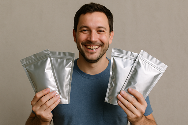
Cannabis packaging has changed a lot since it was merely a place to keep it. Packaging is a blend of branding, marketing, and keeping the product safe in today’s competitive market. One of the clearest illustrations of this transition is the mylar bags that Cali makes. The loud, trend-driven cannabis culture of California was the first thing that inspired Cali-style packaging. It has now become a big player in the business, influencing how companies think about hues, finishes, and how their products look overall.
Cali packs mylar bags are noted for their great shelf presence, high quality, and bold designs. Even when offered as empty mylar bags, they let cannabis firms create their own design without having to make a lot of them at once. As more businesses fight for attention at dispensaries, packaging trends keep leaning towards designs that are easy to recall, stand out, and are easy to see.
How Cali Packs are Growing in Cannabis Packaging
California has always been the best at branding cannabis, and packaging is no different. Cali packs mylar bags became famous since they were in line with what people wanted. The vivid colours, over-the-top graphics, and high-contrast patterns made it impossible to ignore the products. What started as a local style swiftly swept across the country and became a symbol of quality, strength, and modern cannabis culture.
There are more uses for Cali-style mylar bags than just how they appear. They don’t smell, endure a long time, and do a wonderful job of keeping flowers protected from air, light, and moisture. Mylar bags for weed are still one of the most popular types of packaging since they look attractive and work well.
Trends in colour that are changing how cannabis is packaged
People think a lot on the hue of cannabis products. One of the most noticeable trends is using bright, loud colours on black backgrounds. On the shelves of dispensaries, bright greens, purples, reds, and blues stand out. These hue selections are very much like those in Cali packs, where the main objective is to stand out.
At the same time, more and more people are coming to favour colour schemes that are simple and neat. Matte black, white, tan, and muted earth tones are popular among brands that wish to look high-end or health-focused. When used with clean typography and subtle embellishments, these muted colours give off an appearance of elegance and trust.
People are also loving holographic and color-shifting effects more and more. The way these designs catch light from different angles makes the package look high-end and lively. Holographic finishes give firms who employ empty mylar bags a unique look without having to deal with complicated printing methods.
Finishes that Change the Way Packaging Feels
Finish is one of the most significant features of cannabis packing, yet it’s not talked about very much. People are more likely to buy it if it makes a huge influence. Glossy mylar bags are still a must-have for Cali-style packaging because they make colours look brighter and artwork stand out. Glossy finishes are bright and bold, which is a wonderful fit for strains with a lot of THC or that are rare.
On the other hand, high-end and luxury brands are often associated with matte finishes. Matte mylar bags seem smooth, new, and classy. They usually have simple designs or little metal accents that match with them. Soft-touch finishes take it a step further by making the box feel soft and velvety, which makes consumers want to touch it.
Many businesses now blend finishes to make their products stand out. For instance, they utilize matte backgrounds with shiny logos or accents. This layered style gives the design depth and interest without making it overly busy. It works especially well for custom cannabis packaging that wants to look fancy.
Styles That Show What Your Brand Is All About
Streetwear, high-end fashion, and lifestyle branding are having a wider and bigger effect on how cannabis is packaged. Cali packs frequently have big, bold fonts, parody visuals, and humorous pictures that are inspired by hip-hop and sneaker culture. People who consider cannabis as more than simply a product and as a part of who they are like these designs. Styles that are inspired by luxury are also growing more popular, especially in legal markets where brands are getting older. These designs focus on basic shapes, proper spacing, and images that are not too spectacular but still exhibit quality and consistency. There are also eco-friendly fashions coming out that employ natural colours, basic layouts, and statements about being good for the environment. No matter what, the goal is always the same. Packaging needs to tell a story right away. The appropriate mylar bag can make a big difference when customers are in a dispensary with a lot of comparable products.
Why Mylar Bags Are Still the Most Popular Type of Bag
For a good reason, mylar bags are still the finest way to package cannabis, even as trends change. They are perfect for brands of all sizes because they are light, affordable, and easy to store. They also don’t smell and keep cannabis fresh by keeping it out of light and air.
Empty mylar bags let brands change as trends shift. A business can try out new designs, update its logo, or start limited runs without having to pay for pricey custom packaging. This ability to shift is very helpful in a field where looks, tastes, and rules are continually changing.
The Future of Designing Cannabis Packaging
As the cannabis market grows, packaging will remain being helpful and look good at the same time. The easiest way to show off your style is with Cali packs mylar bags, but recent trends show that loud and minimalist may go together. Colours will change all the time, finishes will feel better, and fashions will start to show off lifestyle branding instead of just strain names.
Cannabis companies are no longer putting off packaging. It’s one of the best methods to stand out and show that you are worth anything. The kind of mylar bag you choose—glossy, matte, bold, or plain—can influence how a product feels before you even open it.
If you wish, I can tweak this for certain keywords, change the tone to match your brand, or make it more appealing to dispensary customers than cannabis businesses. Trends in colours, finishes, and styles for Cali Packs and cannabis packaging. Cannabis packaging has gone from plain bags to showy “Cali packs,” which are slang for the colourful, branded mylar bags for pot that debuted in California’s market. A “Cali pack” normally features high-quality cannabis wrapped in a mylar pouch that doesn’t let scents out. The pouch has strain names and bright pictures on it. These packages are now prestige symbols that suggest they hold rare, very potent buds and cost a lot of money. In summary, Cali-style mylar bags are high-quality, resealable pouches that do two things: they keep cannabis fresh and fragrances in, and they also act as small ads for the product. It’s hardly surprise that they are so popular in the business; they have set a new standard for how weed is marketed and exhibited.
What are Mylar Bags in the Cali Style, and why do people appreciate them?
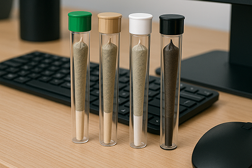
Cali-style mylar bags are little bags that may be sealed with heat. They usually hold 3.5 grammes. They are made of a laminated plastic film with a strong barrier that is sometimes called mylar. They are the best way to package cannabis flower and edibles since they preserve and promote brands. Mylar bags are superior than traditional zipper bags since they keep scents in and protect the contents from light, moisture and oxygen. They also retain the “dank” smell in and make the weed stronger. Most bags come with a zip-lock that is already built in, and they can also be heat-sealed to indicate that they haven’t been opened and to keep them fresh for a long time. In the cannabis community, the word “Cali pack” now refers to not just any mylar bag, but also those branded, graphic-heavy bags that first appeared in California’s legal market. California businesses started selling their greatest strains in custom-made 1/8 oz (3.5g) packets with bright artwork to meet child-resistant and labelling standards and to stand out on dispensary shelves. The packaging was so different that it became known as “Cali weed.”
People liked these Cali packs since they are both functional and fun. They are smell-proof, resealable barrier bags that keep cannabis fresh and out of sight. This is a major step up from flimsy bags. But they are also a blank canvas for branding, which is just as vital. Each bag has vivid logos, strain names (such Gelato, Wedding Cake, and Runtz), and visuals that look like cartoons or street art. This makes a simple pouch into a piece of company culture that people want to acquire. People who buy cannabis legally now want it to come in a well-designed, sealed mylar bag. This proves that the product is authentic and works well. For example, a real Cookies™ strain comes in a bright blue bag that tells the consumer right away that it’s the real thing and not just any unbranded bud. People wanted the package so much that copycat Cali packs started to crop up on the illicit market. These were empty bags that looked like the real thing and were marketed to make bad cannabis look better. The bag alone might make someone pay a lot of money, which never happened before brands were around. This indicates that the way something is packaged may change how much it is worth. In short, people like Cali-style mylar bags because they keep cannabis fresh, strong, and out of sight. People want to buy them more because they look so good.
The Different Looks of Cannabis Packaging
Cannabis packaging has changed a lot, just like cannabis itself, which has gone from being something people did in secret to something that is sold in stores. When you thought of pot packaging a decade or two ago, you might have thought of Bob Marley’s visage on a bag, Rastafarian hues, or tie-dye designs. People only concerned about privacy and utility in the past. Most customers who went to the dealer departed with a plain plastic bag or a boring pill container. It didn’t matter what the brand or style was. Medical dispensaries kept things simple until the early 2000s. They used opaque vials or containers with a pop-top and a basic label that specified what strain it was and how much it weighed. The main purpose of these plain packaging was to keep kids safe and protect anyone from knowing who bought them. They didn’t do anything to set one product out from the others. The idea was to get the medicine to people without making a huge issue out of it.
When marijuana became legal in the 2010s, the way it was packaged changed a lot. As marijuana became legal to sell, the restrictions for packaging changed and new opportunities arose. Regulators set tight restrictions, and it became normal for things to have child-resistant closures, tamper-evident seals, opaque materials, and prominent warning labels. But company owners also recognised that packing might be a terrific method to sell items. Companies began to invest money on unique designs to make their goods stand out and have character. By the end of the 2010s, going to a dispensary was like visiting to a store: each strain or edible had its own appearance and brand. The traditional dime bags were replaced by brightly coloured mylar bags and boxes with unique logos and, where allowed by law, glass windows so you could see the product inside. The most common manner to package flowers was in mylar pouches. Not just plain foil pouches, but also custom-printed, shiny, or holographic bags that scream “premium!” High-end items began to show up in glass jars with smooth labels and lids that kids couldn’t open, like jars of fancy cosmetics or gourmet food. Cookies is a great example of a brand that built an empire on both its genetics and its famous packaging. The clean, bright turquoise-blue colour became instantly recognisable and even made its way into branded clothing. This time period showed that cannabis brands could stand out from the crowd by their design as well as by their strains or potency.
The look changed from counterculture to consumer culture. Designers took ideas from popular lifestyle and retail trends, avoiding obvious cannabis clichés. A lot of modern cannabis products would fit right in with the high-end tea shop or craft chocolate store. To attract wealthier and health-conscious customers, companies wanted their products to look sleek and simple, with simple colour schemes and elegant fonts. The ugly graphics from the 1970s are gone. Instead, we see clean logos, matte finishes, and even packaging that looks like it came from Starbucks or Whole Foods. Cannabis packaging “grew up” to appeal to a wider range of people, from executives to parents. It got rid of the stoner images and replaced them with designs that suggest professionalism, health, or luxury. Not everyone, of course, went for a minimalist look. In fact, diversity in design became a hallmark of the industry. Today, cannabis branding is all about variety. Some brands use simple, monochromatic designs, while others use bright colours and graffiti-style art. This constant testing keeps the visual landscape new and exciting. The one thing that all of them have in common is that packaging is now seen as an important part of a brand’s identity and the customer experience, not something that comes after the fact. One expert on packaging said that modern cannabis packages don’t just hold weed; they also build excitement and trust. Unwrapping a new strain can feel like unboxing a new electronic gadget or gourmet treat, with tear strips and foil layers that make the moment feel special. The change in cannabis packaging, from simple ziplocks to high-end Cali packs, shows how cannabis has gone from being hidden to being in the spotlight. Packaging design has been at the forefront of this change.
Trends in colour and finish: from bright to matte
Trends in cannabis packaging change all the time, and they often reflect bigger design trends and the messages brands want to send. Some brands go loud and bright, while others go quiet and elegant. This is especially true for colour choices. On the loud end, we’ve seen a lot of neon and fluorescent colours brightening up the shelves of dispensaries. Designers are using bright yellows, bold blues, bright oranges, and lively greens that make a strong statement and get people’s attention. These bright colours are meant to be seen and remembered. A pouch that pops with neon pink or slime green can quickly catch the eye of a customer who is browsing.
These bright colours are inspired by everything from streetwear to pop culture (even the recent Barbiecore hot pink trend). They give off a fun, modern vibe and help new brands stand out in a crowded market. Other businesses, on the other hand, are going for a minimalist matte look with muted or single-color designs. A matte black mylar bag with simple gold lettering exudes an upscale, luxury feel, while a matte white or pastel package can suggest purity and wellness. In design psychology, colours like black, dark purple, or navy blue suggest high quality and sophistication. On the other hand, clean whites and earth tones suggest natural or medicinal qualities. These brands use muted colours and matte finishes to appeal to people who like a more subtle or health-conscious look. The packaging is almost like a whisper instead of a shout, which can make the product seem more confident and elegant. Both methods have their pros and cons. The neon route makes the shelf stand out and the matte route makes people feel like they can trust and own the product.
The finishes and materials used on cannabis packaging are just as important because they add visual and tactile interest. Glossy finishes are still popular for brands that want a shiny, eye-catching look. A gloss coating can make colours pop and give packaging a smooth, shiny look. On the other hand, matte finishes have become more popular because they look modern and soft and don’t shine under lights (which is good for reading). A lot of suppliers now sell mylar bags in different finishes, like matte, gloss, and even iridescent holographic, so businesses can pick the one that fits their style. Using soft-touch coatings on packages is a trend that is making waves in high-end cannabis lines. Soft-touch is a special matte lamination that feels soft and smooth, like velvet or rubber, and makes things feel more expensive right away. High-end brands are adding soft-touch finishes to their products to make unboxing feel more sensual, like opening a high-tech gadget or a fancy perfume. When you add other high-end print effects like foil stamping or embossing, this makes packaging that not only looks expensive, but also feels expensive. For example, a box or bag might have embossed logos or metallic foil accents that catch the light and make the design look more interesting. Cannabis packaging has used these methods to show that the product is of high quality and has been cared for. One source in the industry says that luxury cannabis brands now often use “lavish materials like soft-touch finishes, foil stamping, and embossing” on their packaging to make themselves look better. For example, when a customer runs their fingers over a raised gold logo on a matte black jar, the unboxing ritual becomes more memorable. Even holographic finishes are becoming popular, especially with brands that want to appeal to young or cutting-edge customers. A holographic coating or film makes a rainbow shimmer effect that can’t be missed. Under store lights, a holographic mylar bag can shine and change colour as you tilt it, practically calling out to customers. Brands have learnt that these holographic weed bags make their products stand out even when there are a lot of other brands around, giving them a clear advantage on the shelf. In 2025, cannabis packaging is all about making a visual and tactile experience that fits with the brand’s identity. This can be done with neon inks, holographic foils, or soft-touch matte varnishes. The different colours and finishes let each company tell a slightly different story, whether it’s loud or quiet, fun or classy, all through the first impression on the shelf.
Some of the fashions are streetwear-inspired, luxurious, and eco-friendly.
The visual style or theme of cannabis packaging is just as important for branding as the colours and finishes. These days, we can put a lot of designs into three main style groups: streetwear-inspired, luxury boutique, and eco-friendly natural. Each group has its own brand philosophy and target audience. The streetwear-inspired look is on the edgy end of the spectrum. The packaging looks like it would fit in with a skate shop or a Supreme™ store. This style often has big, graffiti-like letters, bright pictures, references to pop culture, and an overall cool vibe that comes from living in the city. Some cannabis brands work with street artists or use designs that look like sneaker culture and hip-hop album art for a reason. These pouches are all about getting in touch with the times. Think of neon cartoon characters, trippy patterns, or retro 90s graphics that make you feel fun and rebellious. Younger people and the “hypebeast” crowd, who see cannabis as part of their lifestyle, like these kinds of designs. This is where the Cali pack trend started. Many Cali packs have flashy artwork and even make fun of famous logos (for example, bags that look like cereal boxes or have comic book characters on them), which has led to a market for collectibles. As The Dieline noted, cannabis packaging can range from “psychedelic patterns, bold illustrations, [and] retro-inspired vibes” to luxury aesthetics, all coexisting in the market. Streetwear-style brands love that mix of cultures and maximalism. They make it clear that their product isn’t your grandma’s medical marijuana; it’s part of a modern, creative, and maybe even naughty way of life. This kind of packaging gets a lot of attention on social media. People often post pictures of cool bags on Instagram, which is a great way to get free advertising. But it’s important to find a balance between creativity and following the rules. Designers still need to include the required warnings and symbols without losing the urban art vibe.
On the other hand, the trend of luxury-inspired packaging comes from high-end stores and cosmetics. These designs are simple, classy, and well-made. A high-end cannabis brand might use a simple colour scheme (black, white, metallic gold, or marble textures) and clean, sans-serif labels. The goal is to market their product as a high-end treat or health product, like fine wine or designer skin care. You won’t see any cartoon graphics or bright colours. Instead, you’ll see subtle foil logos, debossed patterns, and high-quality containers like glass or custom tins. This kind of packaging often feels special. For instance, an eighth-ounce of top-shelf flower might come in a heavy dark glass jar inside a sleek box with an embossed logo and a magnetic closure. These would fit right in at a fancy store or spa. This kind of approach helps cannabis companies connect with wealthy customers and older, professional customers who might not like the flashy “stoner” look. Brands use fancy fonts and simple designs to show that their product is high-end and reliable. We have seen cannabis packaging copy the strategies of high-end chocolate or craft spirits by selling a sense of style and sophistication. One of the first people to notice said that designers began “emulating designs of products found in Starbucks or Whole Foods, with simple designs [and] sleek appearances,” on purpose avoiding the clichés of old cannabis art. In these designs, the marijuana leaf icon is often made smaller.
It might be a small gold emblem or not be there at all, like how high-end alcohol might not show its ingredients. The focus is on brand storytelling and mood. For example, an indica strain line might use deep purples and a night-sky theme to suggest relaxation, while a sativa strain line might use bright daybreak colours to suggest energy. All of this is done in a tasteful, simple way. Not only does luxury packaging draw in picky customers, but it can also justify higher prices because people tend to think that a product that is well-packaged is more valuable (the “Apple product” effect).
Another big trend is eco-friendly branding on cannabis packaging. This shows that both the industry and consumers are becoming more aware of sustainability. Using green colours isn’t the only thing that makes packaging eco-friendly (though earth tones and natural textures are popular in this area). It’s also about showing that a brand cares about the environment through the materials and visuals they choose. Eco-friendly brands might use materials that can be recycled or broken down, like mylar bags made from recycled plastic, compostable bio-plastic pouches, or containers made from kraft paper and cardboard instead of foil laminates. The way these packages look often fits with the natural vibe. There are a lot of leaf patterns, muted greens and browns, and matte finishes that make them look raw and organic. They might put messages or icons about sustainability on the packaging to show that it can be recycled or made from hemp-based materials. People who care about values really like this style. In fact, surveys show that a large majority of consumers prefer sustainable packaging—82% of respondents in one 2023 survey said they’re willing to pay more for eco-friendly packaging. So, using eco-friendly design is not only good for the environment, but it can also help the brand’s image and make customers more loyal. For example, a cannabis company could use a simple brown kraft pouch with a single-color logo and a small line of text saying that the pouch is 100% compostable. This would show right away that they care about more than just making money.
The brand’s message and images fit with the product’s values, especially if it’s an organic flower grown in the sun or a wellness-focused edible. Customers like when a jar can be reused or a bag is made from plant fibres, so sustainable packaging can also be a talking point. Designers are finding clever ways to make these packages attractive too – using eco-inks, plantable seed paper for labels, or modular packaging that reduces waste. The eco-conscious style is all about getting the trust and respect of customers who care about the environment while still making a package that looks good. A lot of brands say that using eco-friendly packaging makes their brand story better and makes people feel good about their brand.
It’s important to remember that these style trends aren’t mutually exclusive; some of the most interesting cannabis packaging uses parts from all three styles. You might find a streetwear brand that prints its bold graphics on a recyclable pouch with soy-based inks. This combines hype with being good for the environment. Or a high-end brand that keeps things simple but adds a pop of colour or a graffiti-style font to the inside of the box lining for a twist. The best designs look good and stay true to the brand’s values at the same time. It’s clear that today’s cannabis packaging is very brand-savvy, whether it has a flashy hologram or a simple herbal design. Companies are picking colours, finishes, and styles that tell their story right away, whether that story is “we’re fun and rebellious,” “we’re refined and caring,” or “we’re eco-smart and healthy.” This is all to get people’s attention and keep them coming back in a market where packaging might be the first thing someone sees of the product.
What does packaging do? It makes things seem good on the shelf, keeps them fresh, and makes sure they follow the law.
In a dispensary or smoke shop, the packaging isn’t just a box; it also sells the product inside without saying a word. A well-designed package does all of these things at once: it looks good on the shelf, keeps the food fresh, and follows all the rules. In the cannabis business, where there is a lot of competition and strict rules, these three functions are very important. One packaging expert summed it up well when they said that cannabis packaging today is all about ‘compliance, freshness, bra
First, let’s talk about how appealing it is on the shelf. When a customer looks at a display case full of jars and bags that all look the same, the packaging that stands out more is more likely to be picked up. Cannabis companies know this, which is why they have been so creative with colours and designs, as we talked about above. The packaging needs to say right away, “Pick me!” “I’m the one you want.”
Bright colours, interesting shapes, or high-quality images can all catch the eye. Even for brands that want a more subtle look, clarity and attractiveness are still important. The logo should be clear and well-placed, and the overall look should fit the brand’s message. It’s not enough for a product to look good on the shelf; it also needs to be easy to tell what kind of strain it is, what its name is, and how it stands out from other products on the shelf. For example, a line of edibles could have the same design but different colour accents for each flavour or strain, which would make it easy for regular customers to find their favourite. The packaging is the first thing people see when they look at a product, and studies of consumer behaviour show that people make judgements about quality within seconds of seeing a package. Brands put a lot of effort into packaging design because it’s a great way to market their products. Cannabis packaging in the early 2010s was simple and clinical, but once companies figured out that eye-catching designs increase sales, they started to take more risks. Using die-cut mylar bags in shapes that are different from the usual rectangular ones, like fruits or characters, is a great recent example. These bags stand out on a shelf right away. In general, shelf appeal is about getting the customer’s attention and showing that the product is high quality right away, so it has a chance in a crowded market.
Next is keeping the product fresh and safe, which is one of the main jobs of packaging. If you don’t store cannabis correctly, it can dry out, lose potency, or get contaminated. Traditional clear plastic baggies didn’t do much to keep things fresh because they weren’t airtight, let in light, and trapped moisture. On the other hand, modern packaging is made to keep out things that make things go bad, like oxygen, UV light, and humidity. Mylar barrier bags are a great example. They make a seal that is almost impossible for oxygen to get through, and they often have foil layers that block light, which keeps cannabinoids and terpenes from breaking down. This means that the weed you buy will stay strong and smell good for longer. A person might not think about the science of the bag, but they will definitely notice if their herb is dry or flavourless because of bad packaging. That’s why businesses focus on things like heat-sealability and airtight zippers. A lot of mylar packages have a heat-sealed top that the customer tears off to show that it hasn’t been opened. There is also a zip-lock underneath that can be used to seal it back up for storage. This keeps the product as fresh as possible even after it has been opened. Some packaging even includes extras like humidity control packs inside jars or bags to maintain ideal moisture levels. You can really tell the difference: bud kept in a good mylar or glass container can stay fresh for months, but in a cheap baggie, it might break up or get harsh quickly. Also, good packaging keeps odours from leaking out. This isn’t just for privacy; it also means that the aromatic compounds (terpenes) stay in your flower, where they belong, instead of going into the air. Keeping that “dank” smell in the bag is the same as keeping the flavour and effects in the product. So, packaging that focusses on freshness is a win-win: customers get a better experience (fresh, fragrant cannabis), and brands benefit because their product lives up to its promise of quality. One reason mylar bags are called the “gold standard” is that they make weed last much longer and keep its “just-packed” quality.
We can now even buy special packaging for concentrates or edibles that keep them fresh. For example, oil concentrates come in airtight glass containers with silicone lids to keep them from sticking together and losing terpenes. In short, one of the most important jobs of packaging is to keep things fresh and strong so that the last nug or gummy is just as good as the first.
Lastly, cannabis packaging must follow the law at all times. Cannabis is heavily regulated, so every package must meet certain requirements in order to be sold legally. This includes child-resistant features, clear labels for THC content and health warnings, and designs that are often opaque or can be sealed again, as required by state law. This means that a lot of cannabis packaging has to pass tests that are similar to those for pharmaceutical packaging. Child-resistant (CR) closures are everywhere. For example, jars can have push-and-turn caps, bags can have slider locks, and zippers that kids have to pinch and pull to open. The packaging industry has come up with smart CR mylar bag designs that meet the needs of regulators and are still easy for adults to use. The “Pinch N Slide” bags are one example. To open them, you have to squeeze and pull at the same time. Compliance also requires tamper-evident seals so that customers can be sure that the product hasn’t been tampered with between the factory and the store. That’s why bags often have heat-sealed tops or jars have shrink bands on them.
These are normal safety features. In addition, every package must have the right labels and symbols, such as the universal THC warning symbol (a triangle with a cannabis leaf and exclamation mark in many places) and statements like “Keep out of reach of children and animals.” There are also usually rules about what information must be on the package, such as the net weight, strain name, potency (THC/CBD percentages), batch numbers, and expiration dates. There is a lot of information here, so the packaging needs to have room for it all to be read easily. Some brands use this in a nice way in their design, while others use extra stickers. A well-planned package makes sure that all of this information is clear and follows the rules without making the brand look messy. For instance, a lot of Cali packs have a blank space or an extra label on the back for all the legal information, which keeps the front design clean. Being compliant also means using the right materials. For example, many places require that packaging for food be opaque (so kids aren’t tempted to eat it) and that all packaging be resealable if it holds more than one serving. Mylar bags check those boxes: they are easily made opaque and can be fitted with child-resistant, resealable zippers. For companies that make things, keeping up with these rules is a big part of designing packaging. Packaging may need to be changed if a state changes its rules, such as by adding new warning phrases or QR codes to test results. This is why there are now a lot of specialised cannabis packaging design companies and suppliers that focus on making solutions that are both legal and creative. In short, a cannabis package must be a legal fortress that keeps kids out, gives the customer full information, and follows all local laws—all while still looking good enough to sell the product. This is a tough job, but modern cannabis packaging has mostly done it, showing that safety and attractiveness can go hand in hand.
Customisable, high-quality packaging that doesn’t smell is worth more.
There is a simple truth at the crossroads of all these trends: good packaging makes cannabis products worth more, both in terms of real value and how people see them. For both new and established cannabis brands, buying high-quality, customisable packaging that doesn’t let smells out is not just a cost, but also a chance to make their product stand out to customers. Let’s break down why these features are important and how they help a brand do well.
First, smell-proof functionality is practically a must-have now. Cannabis is well-known (or infamous) for its strong smell. People who know what they’re talking about love the skunky, piney, or fruity smells, but no one wants those smells to leak out at the wrong time or place. A smell-proof bag or jar keeps the product hidden while it’s being moved and stored, which is a big plus for people who care about privacy or politeness. As was said before, containing the smell means containing the product’s important parts, which is even more important. Quality mylar bags that keep smells out keep the terpenes and other volatile compounds that give cannabis its taste and effects.
This has to do with freshness: if you can’t smell anything through the bag, you can be sure that the bud inside hasn’t gone bad. Packaging that doesn’t let smells out shows that a brand cares about the whole experience of the customer, from the moment they buy it to the moment they use it. It also shows that they care about the customers’ environments; no one wants their room or car to smell like cannabis unless they want it to. In a way, keeping smells in builds trust because customers know they can carry your product without worrying. Because of all these reasons, “smell-proof bags” has become a key selling point and keyword (just search online and you’ll find many suppliers who stress this). In the end, packaging that keeps odours and freshness in check makes the product more enjoyable and useful, which makes people think it’s worth more. People will like a brand that always has a strong smell when they open the package, but not before.
Next, branding and the ability to make things your own. Custom cannabis packaging, which means putting your logo, art, and unique design on the package, is now very common. It’s helping to boost sales and brand loyalty. A plain, generic container might hold the same herb, but a bag with a unique design and your brand name on it will make your product stand out on the shelf. People like packaging that looks professional and different. On the other hand, something with just a basic label might seem cheap or easy to forget. Even small cannabis companies can get people to know their brand by making their packaging unique. The packaging itself becomes a form of advertising. Every mylar bag or pre-roll tube that a customer has is like a mini billboard that they can see. This is especially true if the design is so nice that people might keep or show off the packaging. Some collectors keep bags of their favourite strains because they like the art. Custom, well-designed packaging gives a product a “elevated look” that can justify a higher price and make people want to buy it again. It tells the customer without them knowing that this brand is well-known and sure of its product. After all, they spent money on good packaging, so the product is probably good too.
Customisation also means being able to change things up. For example, a medicinal line might have a clean, clinical design, while a recreational line might have a more fun design. Cannabis also comes in a lot of limited edition or seasonal packaging these days, like special bags for 4/20 or strain-specific art. This is only possible with custom packaging. In short, using custom packaging helps create a consistent brand image and makes the product more appealing, which leads to higher perceived value and even collectible appeal.
Lastly, the effect of good materials and design on how much people think something is worth can’t be overstated. People are very influenced by packaging. Research in many fields shows that people often think that the quality of the packaging is the same as the quality of the product. In the cannabis industry, where many products have similar effects, the packaging can make one product seem more premium than another. Good packaging shows that a brand cares about even the wrapper and has spent money on it, which suggests that what’s inside is special. One article said that packaging is like a “silent salesperson” that tells you about the quality and value of a product before you even use it. When a customer holds a matte-finish jar with an embossed logo or a sturdy mylar pouch with vibrant high-res printing, they get a subconscious message of quality that raises their expectations (and often their willingness to pay). On the other hand, if the packaging is weak, leaks, or has printing mistakes, it can make the contents seem less valuable, even if the cannabis itself is great. The soft-touch finish, foil accents, and thicker-gauge materials that don’t tear all add to the feeling of luxury and dependability. These touch and sight cues can make the user’s experience of the product better. It’s not just how it looks; how well it works is important too.
A child-proof mechanism that works well and feels smooth and safe, or a zip that always lines up and closes perfectly, makes the user experience smooth and high-end. People like brands that pay attention to the details, and brands that don’t skimp on packaging often find that it makes customers happier and more loyal. High-quality packaging also often means better protection (as we saw with freshness), which means the product quality stays high until it is eaten. This is another way it literally adds value. Overall, spending money on better packaging creates a virtuous cycle: it draws in customers, makes unboxing and using the product better, and leaves a positive impression that can lead to repeat business.
In the end, Cali packs and the general trends in cannabis packaging show that this is a field where branding and engineering meet, as well as creativity and compliance. People expect cannabis packaging to look great, work well, and tell a story, whether it’s a loud holographic mylar bag or a simple, elegant jar. It has to keep those valuable buds fresh, follow all the rules, and fit in with the values and way of life of the target consumer. Neon colours or holographic shines for shelf wow factor, matte blacks or earth-tone greens for a message of quality and ethos, soft-touch or gloss finishes for tactile appeal, and endless custom graphics to show what makes each brand unique are all about finding that balance. Cannabis startups and buyers of packaging have more choices than ever when it comes to making something special—a package that not only holds the product but also represents the brand and appeals to the senses of customers. One thing is clear as the industry matures: good packaging sells weed. It makes products look better on the shelf, keeps them fresh and compliant, and improves the whole customer experience with smell-proof, customisable, high-quality designs. Packaging is no longer an afterthought in a very competitive market; it is now a strategic asset and an extension of the product’s value. So, whether you like the flashy Cali packs or the stylish, eco-friendly pouches, keep in mind that a lot of thought and trend-watching went into that little bag in your hand. Cannabis and culture come together in packaging, which is a fun area that keeps coming up with new ideas and setting the tone (and colour scheme) for the growing cannabis industry.